Guardvark
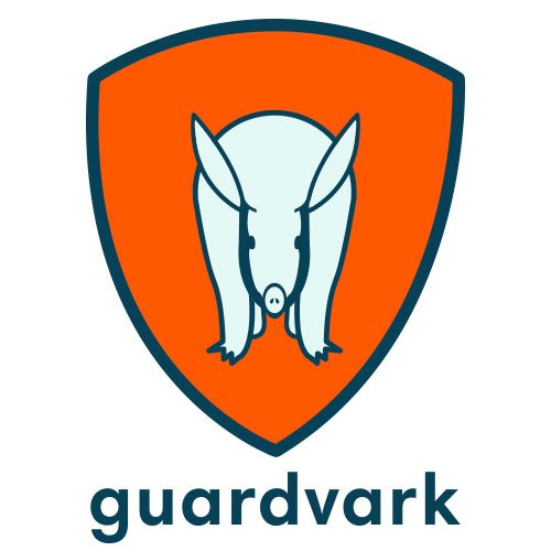
I was commissioned to design a logo for a beta project—an online raffle app for schools. The client emphasised the importance of creating a professional yet secure image for the app. Although the client initially had a clear vision, we realised during the design process that adjustments were necessary. Through collaborative discussions and thoughtful revisions, we successfully developed a final logo that met all objectives.
The final design features a balanced mix of calm and strong colors, paired with a bold font that remains inviting. Our goal was to create a logo that conveys security without being off-putting, ensuring it resonates with users.
The client also required versatile logo variations for use across various materials, which guided our choice of adaptable colour options.


