Blue Bee Mortgages
Rebrand
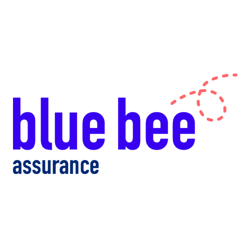
blue bee hadn't rebranded for over 20 years and it was time to breath some new life into it. I was commissioned to create a new look and feel for the business which also included a separate assurance side.
I wanted to add a nod to the 'bee' element without it being too overwhelming, so I created a little hint. It represents new beginnings and on to pastures new, which for a mortgage company felt appropriate. I used clean and clear colours with friendly fonts as this can be a stressful time for a lot of people so we wanted the logo to be welcoming.
The icon part of the logo can be used as a stand alone asset across various elements on or offline to make sure the brand is represented well.


As well as mortgages there was the assurance side of the business that needed a new logo that was obvious it was the same business. So I made sure there was a striking contrasting colour in the palette that we could use and adapt for this part of the business.