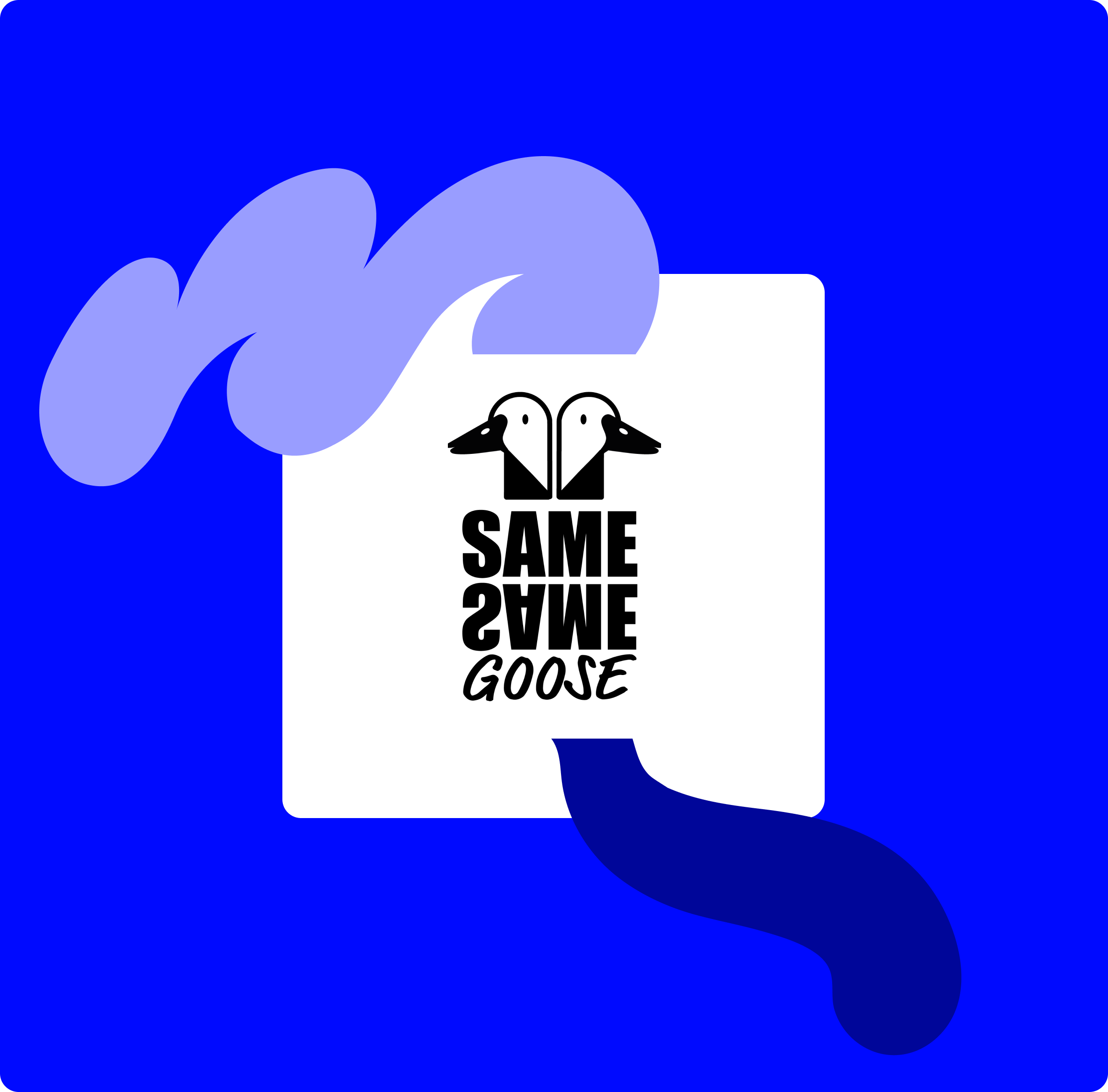
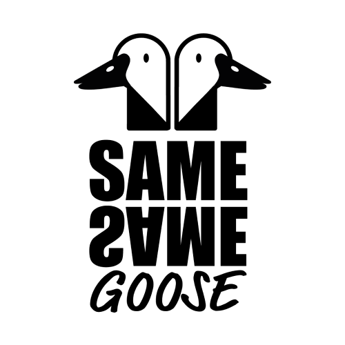
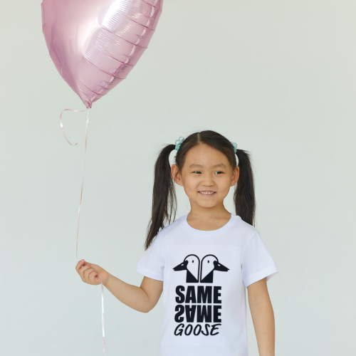
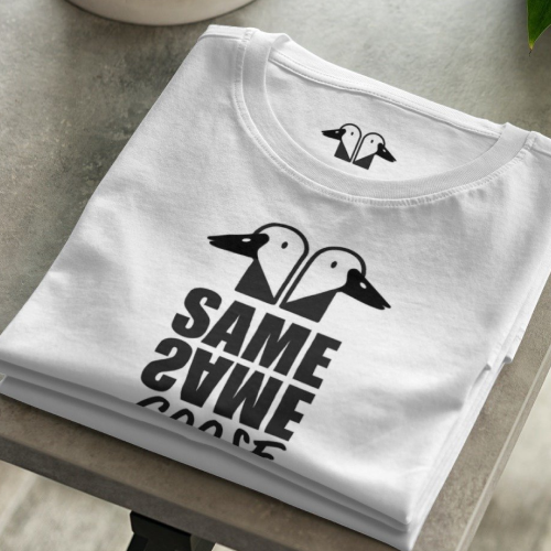
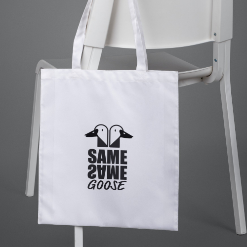
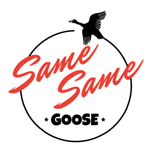
Same Same Goose
Logo Exploration
I was commissioned to create the branding for a startup clothing company named ‘Same Same Goose,’ targeted towards the LGBTQ community and their children. The brand needed to be bold and standalone, yet versatile enough to complement other artwork. I chose a primary black and white color scheme and incorporated a mix of bold and playful fonts. Additionally, I included a subtle heart element between the two geese as a nod to the love within the community.
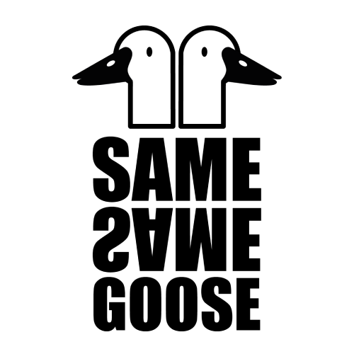
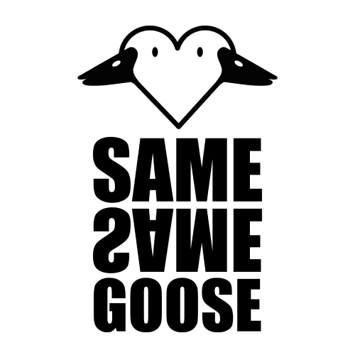
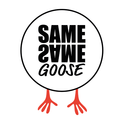
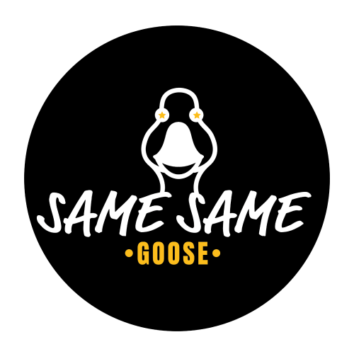
Logo Exploration
All logo designs begin with an exploration of ideas. Knowing the client wanted to incorporate geese and desired a bold, striking design, we focused on identifying their preferences. This stage involves experimenting with fonts, colours, and overall concepts to create a variety of distinct options. By presenting diverse ideas, we make it easier for the client to make informed decisions.
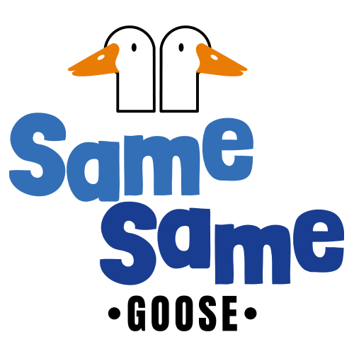
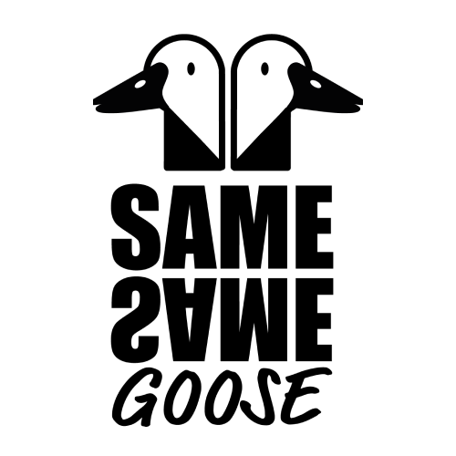
Logo Continuation
Once the client reviews the designs, it’s common for them to favoir elements from multiple concepts. The next phase involves refining the logo based on the client’s feedback to create the final design. Usually by this phase it’s refining the finer detail and correcting fonts.