
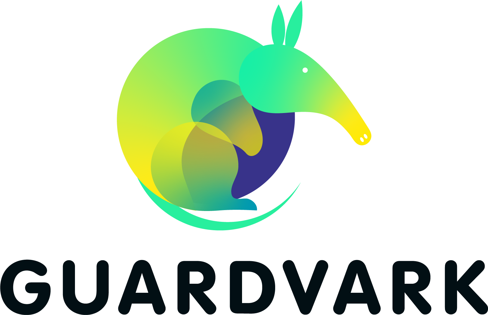
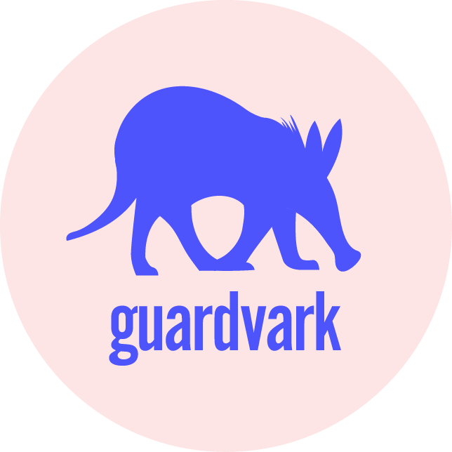
Guardvark Logo Design
I was commissioned to design a logo for a beta project—an online raffle app for schools. The client emphasised the importance of creating a professional yet secure image for the app. Although the client initially had a clear vision, we realised during the design process that adjustments were necessary. Through collaborative discussions and thoughtful revisions, we successfully developed a final logo that met all objectives.
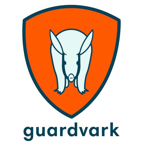
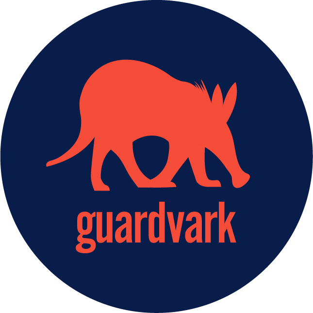
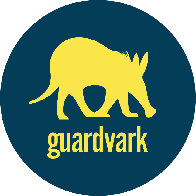
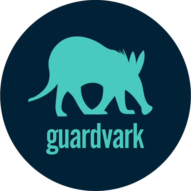
The final design features a balanced mix of calm and strong colors, paired with a bold font that remains inviting. Our goal was to create a logo that conveys security without being off-putting, ensuring it resonates with users.
The client also required versatile logo variations for use across various materials, which guided our choice of adaptable colour options.
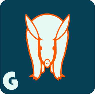
Logo Exploration
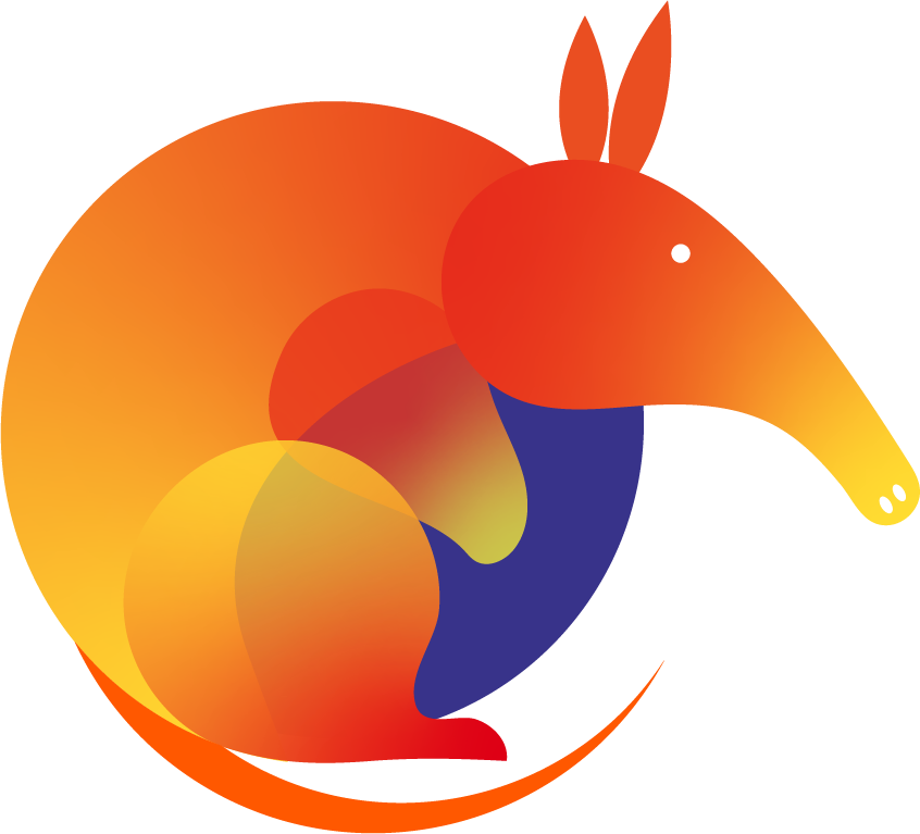
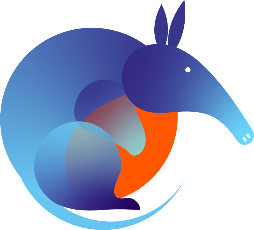
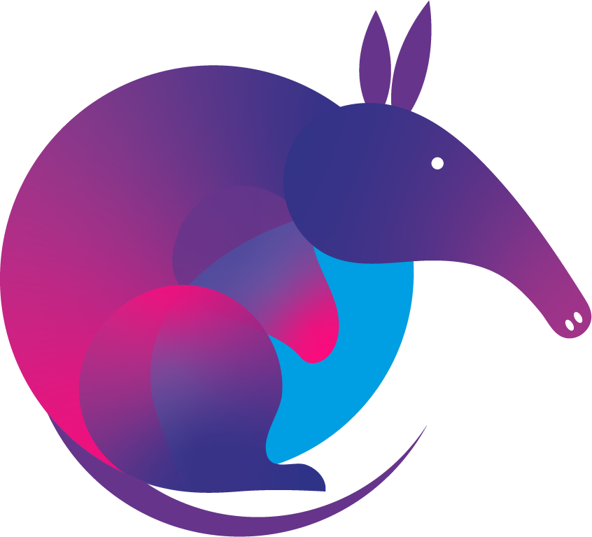
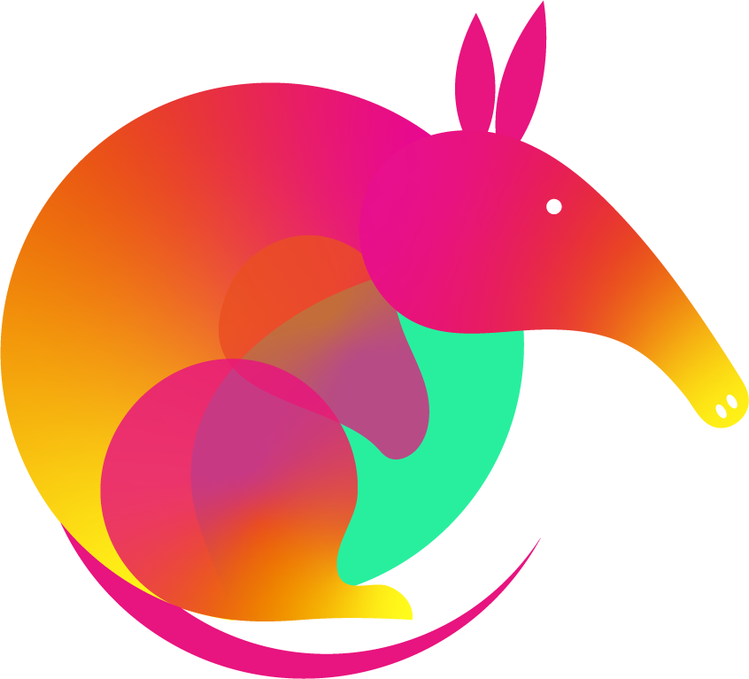
This project was a prime example of the importance of exploration in design. While the initial brief included gradients and a wide colour palette, we found that these elements didn’t fully achieve the desired outcome, particularly in terms of accessibility and coherence across different applications.
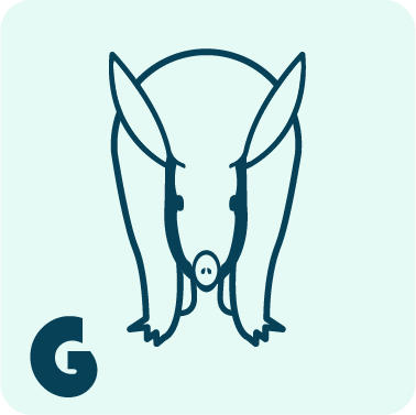
Further Exploration
Recognising the need for something bolder and more refined, I experimented with flatter designs and more subtle tones. Although this approach was closer to the mark, I felt the aardvark element could be stronger.
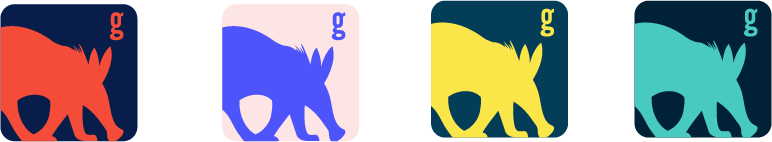
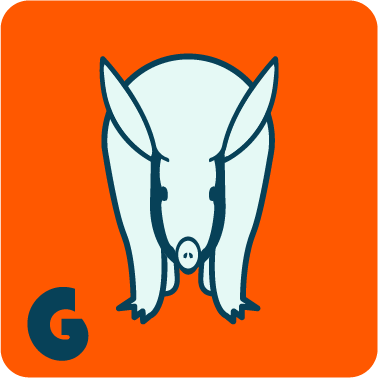
After further exploration with gradients, striking colors, shapes, and fonts, I developed a version that, while different from the client’s initial vision, ultimately exceeded their expectations.
Design can be challenging to articulate, but I firmly believe that exploration and adaptability lead to the best results. This project reinforced my confidence that, through collaboration and iteration, the final outcome will always be worth the effort.